Static vs Dynamic Contrast Ratio in Industrial Displays
Compare static and dynamic contrast ratio in industrial LCDs, including measurement methods, ambient light effects, and engineering checks.
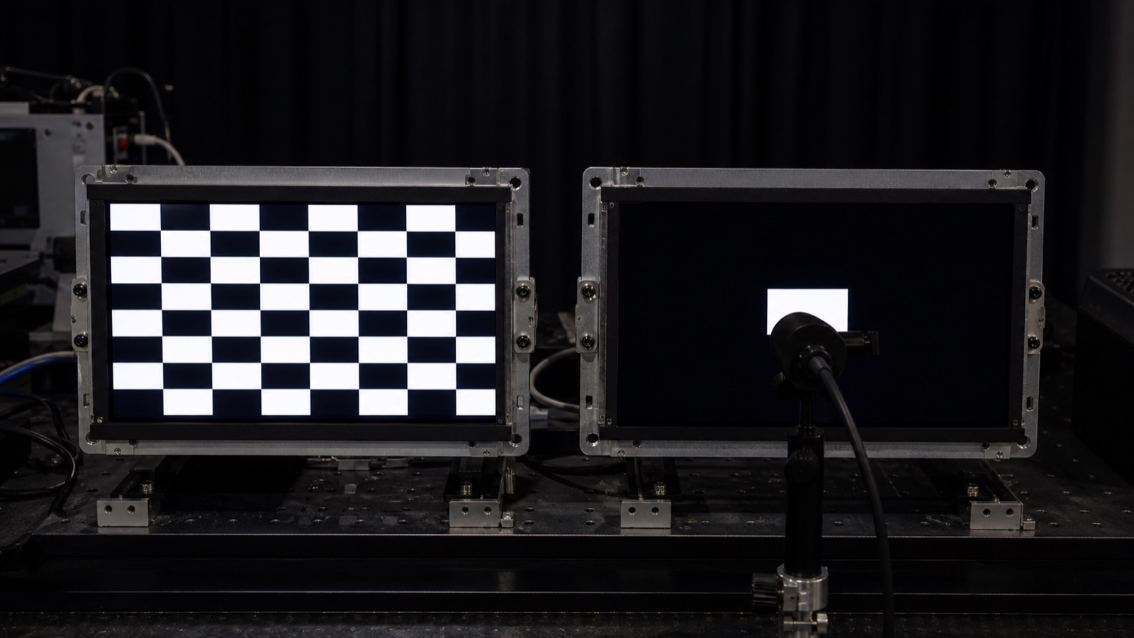
A display listed at 1000:1 can look better in a control panel than another display advertised at 1,000,000:1. There is no contradiction. The first number may be a static contrast ratio measured with one backlight condition; the second may be a dynamic ratio calculated while the backlight changes between different images.
Both measurements can describe real behavior. They do not describe the same behavior, and they should not be compared in one ranking table.
For most industrial HMIs, the useful starting points are static contrast, black luminance, viewing angle, and contrast under ambient light. Dynamic contrast becomes relevant when the display intentionally changes its backlight with image content or operating mode.
What contrast ratio measures
Contrast ratio is the relationship between a display’s white luminance and black luminance:
Contrast ratio = white luminance / black luminance
If a display measures 800 cd/m² on white and 0.8 cd/m² on black under the same condition:
800 / 0.8 = 1000:1
The ratio is sensitive to the denominator. Small changes in black measurement, instrument stray light, room reflection, viewing angle, or backlight leakage can change the result substantially. A credible specification therefore needs the pattern, meter geometry, backlight setting, temperature, and calculation method.
Static contrast ratio: one operating condition
Static contrast, sometimes called native contrast, compares white and black while the display remains in the same basic operating state. The backlight is not deliberately reduced for the black measurement.
Depending on the test method, white and black may be measured from areas of one pattern or from separate full-screen patterns while keeping the backlight fixed. The key point is that the display is not allowed to manufacture a darker black simply by dimming or turning off the light source between measurements.
Static contrast is useful for interfaces that show bright and dark content at the same time:
- White text on a dark alarm screen.
- Trend lines over a black graph area.
- Buttons, labels, and icons on mixed-tone layouts.
- Camera or inspection images beside menus.
- Medical-style screens with grayscale and status overlays.
It does not describe everything about image quality. Gamma, grayscale tracking, surface reflection, viewing-angle shift, local mura, and color accuracy still matter. But it is usually a more honest first comparison for a fixed-backlight industrial HMI than a large dynamic number.
Dynamic contrast ratio: the backlight is allowed to change
Dynamic contrast compares luminance while the display changes its light output or processing between scenes. On an LCD, the system may dim the global backlight for a dark image, use local-dimming zones, alter pixel values, or combine several methods.
Consider the same 800-nit display. With the normal backlight fixed, black is 0.8 cd/m² and static contrast is 1000:1. If the display dims its backlight by a factor of 100 during an almost-black scene, the measured black might fall to 0.008 cd/m². Comparing maximum white from one state with black from the dimmed state produces:
800 / 0.008 = 100,000:1 dynamic contrast
That figure can describe the transition between a bright scene and a dark scene. It does not mean the display can show an 800 cd/m² white indicator and a 0.008 cd/m² black background simultaneously with a single global backlight.
Dynamic contrast can still be valuable. It may improve dark video, reduce power on dim screens, lower night-mode glare, and deepen black during boot or standby. The problem is not the technology. The problem is using its largest ratio as if it were directly comparable with static panel contrast.
Global dimming and local dimming are different
With global dimming, the entire backlight changes together. A mostly dark screen can become darker, but a small bright warning or white cursor may force a compromise: keep the backlight high and accept gray blacks, or lower the backlight and reduce the bright element.
With local dimming, the backlight is divided into zones. Dark regions can receive less light while bright regions receive more. This can improve same-scene contrast, but zone count, optical spread, control latency, and the UI layout matter. A white label on a black background may produce a halo because one backlight zone is larger than the label.
Industrial interfaces create difficult local-dimming cases:
- Small high-contrast text.
- Thin grid lines and trend traces.
- Blinking alarms.
- Fixed status bars next to dark image areas.
- Subtle gray controls that must not change when another region brightens.
If local dimming is part of the product, test the actual UI, not only a high-impact demo video. Watch for halos, pumping, crushed shadow detail, subtitle-like flicker, and brightness changes in elements that should remain stable.
Ambient light can erase a strong dark-room ratio
Datasheet contrast is usually measured in controlled conditions. In a factory, vehicle, kiosk, or outdoor installation, the front surface reflects the environment. Reflected luminance is added to both white and black:
Ambient contrast ≈ (display white + reflected ambient light)
                   / (display black + reflected ambient light)
Using the earlier 800 cd/m² white and 0.8 cd/m² black example, add 40 cd/m² of reflected ambient luminance:
(800 + 40) / (0.8 + 40) ≈ 20.6:1
The original static ratio was 1000:1. In this simplified outdoor condition, visible contrast is closer to 21:1. Improving dark-room black from 0.8 to 0.4 cd/m² barely changes the ambient result, while reducing reflection can make a much larger difference.
That is why optical bonding vs air bonding and cover-glass treatment belong in a contrast discussion. The LCD cell is only one surface in the finished product.
IPS, VA, and TN numbers need context
LCD mode influences native contrast and viewing behavior. VA panels often achieve deeper on-axis black than typical IPS designs. IPS usually provides more stable color and gamma over wider angles. TN may be cost-effective and fast, but its viewing-angle behavior can be less forgiving.
Those are tendencies, not a substitute for the module specification and sample review. A well-integrated IPS panel with controlled reflection can outperform a higher-native-contrast panel in the real mounting position. Conversely, an application that is always viewed straight-on in a dark environment may value VA black level more than wide-angle consistency.
Use the IPS vs TN vs VA engineering comparison to choose the technology family, then measure the candidate module through the final front stack.
Why contrast claims become hard to compare
Two suppliers can publish different ratios for similar hardware because the methods differ. Common variables include:
- Full-screen sequential white/black versus checkerboard or simultaneous patches.
- Center measurement versus an average across the screen.
- Bare LCD versus cover glass or bonded touch stack.
- Maximum backlight versus a nominal backlight setting.
- Backlight fixed versus global or local dimming enabled.
- Perpendicular viewing versus a stated angle.
- Dark-room measurement versus controlled ambient light.
- Instrument floor, flare correction, aperture, and distance.
- Typical sample versus guaranteed minimum.
- Room-temperature measurement versus a wider operating range.
When the datasheet does not state the method, the ratio should be treated as a comparison hint, not a production guarantee.
A better contrast specification for an industrial product
Instead of placing one large number in the product requirement, define the conditions that matter:
| Requirement | Example of a useful definition |
|---|---|
| Static contrast | Minimum ratio at room temperature, fixed backlight, perpendicular measurement |
| Black luminance | Maximum value at the normal operating brightness |
| Viewing position | Contrast and color acceptable from defined operator angles |
| Bright ambient | Real UI remains readable at specified illuminance and product orientation |
| Night mode | No gray washout, visible PWM artifacts, or excessive minimum luminance |
| Temperature | Readability checked at hot and cold operating points |
| Local dimming | No unacceptable halo, pumping, or alarm brightness shift with production UI |
The exact thresholds depend on the application. The value of the table is that it turns “good contrast” into evidence that engineering, quality, and the supplier can reproduce.
How to test static contrast
For a practical comparison among candidate modules:
- Disable dynamic contrast, content-adaptive backlight control, auto brightness, and local dimming unless those features are being evaluated separately.
- Set and record the backlight current or command.
- Warm up each display for the same time.
- Use a controlled dark environment and fixed meter geometry.
- Measure white and black with the same instrument settings where possible.
- Repeat the measurement at the center and inspect edge leakage separately.
- Test the intended viewing angles, not only perpendicular.
- Repeat through the final cover lens and touch stack.
- Record temperature, UI pattern, firmware version, and sample identity.
Very low black measurements can approach an instrument’s noise or stray-light floor. If changing distance, aperture, or room shielding changes the result dramatically, investigate the setup before declaring a superior panel.
For production, it may be more robust to control white luminance and black luminance separately in addition to the calculated ratio. A ratio can remain unchanged while both values drift in a direction the user notices.
How to evaluate dynamic contrast without being misled
Dynamic behavior needs a time-based test. Use transitions that resemble the product:
- Bright dashboard to dark night screen.
- Dark screen with one alarm indicator.
- Scrolling text over a dark background.
- Camera image with menus and overlays.
- Boot logo, sleep screen, and wake transition.
Watch for the time it takes the backlight to settle, whether the whole UI visibly breathes, and whether critical elements lose brightness. Measure both the darkest achievable state and a mixed-content state. If the feature improves a full-black screen but makes live operation unstable, the headline ratio has little operational value.
VESA’s DisplayHDR criteria make a useful methodological distinction: static contrast uses white and black within one scene, while active-dimming performance compares behavior across different images. Industrial products do not need to use the VESA thresholds, but they benefit from keeping those two questions separate.
UI design can preserve usable contrast
Hardware is only part of the result. Thin gray text, low-opacity icons, subtle borders, and compressed grayscale can make a capable panel look poor. A practical industrial UI should reserve its strongest contrast for information that carries operational meaning.
Use larger type for critical values. Avoid relying on tiny differences between adjacent dark grays. Check alarm colors at low brightness and at off-axis viewing positions. If the display uses local dimming, avoid patterns that repeatedly trigger zones around fine text.
The goal is not to maximize every screen’s visual drama. It is to keep status, control, and alarm information stable under the conditions in which people make decisions.
Final recommendation
Use static contrast ratio for the first comparison of conventional industrial LCD modules, and ask for the associated white and black luminance values and test conditions. Evaluate dynamic contrast as a separate system feature with real UI transitions. Then test ambient contrast through the final cover glass under the actual installation light.
A large dynamic ratio can be technically valid and still irrelevant to a mixed-content HMI. A moderate static ratio can be entirely adequate when reflection, viewing angle, brightness, and UI design are controlled. The correct number is the one tied to the user’s task and a repeatable measurement.
For the other half of the readability question, read Display Brightness Explained: Nits, Luminance, and Real-World Needs and the outdoor readability and optical bonding guide.
FAQ
Is dynamic contrast ratio fake?
Not necessarily. It can describe real backlight or image-processing behavior across different scenes. It becomes misleading when it is compared directly with static contrast or used to imply that maximum white and minimum black occur simultaneously.
Which contrast ratio matters most for an industrial HMI?
Static contrast and black luminance are usually the better starting points because industrial screens often show bright and dark elements together. Ambient contrast, viewing angle, front-surface reflection, and UI design may matter even more in the finished product.
Is a higher static contrast ratio always better?
Higher static contrast can improve black depth and separation, but it is not the only selection criterion. A panel with less stable viewing angles, poor outdoor reflection, weak temperature behavior, or inconsistent production quality may still be the worse choice.
Why does contrast look lower outdoors?
Ambient light reflects from the cover lens, touch stack, and internal interfaces. This reflected luminance lifts the apparent black level, reducing the visible white-to-black ratio even though the LCD’s dark-room performance has not changed.
Can optical bonding improve contrast ratio?
It can improve contrast under ambient light by reducing internal reflective interfaces. It does not change the LCD cell’s native dark-room contrast in the same way that a different LCD mode would, but it can materially improve what the user sees through the finished stack.
Technical reference
- VESA Certified DisplayHDR performance criteria — definitions and separate test concepts for static contrast, black level, and active dimming.