Common Mistakes When Choosing a Sunlight-Readable TFT Display
A field-oriented look at common mistakes in sunlight-readable TFT display selection, including brightness-only thinking, weak optical stacks, poor thermal margin, and UI contrast issues.
Sunlight-readable display selection often starts with a simple question: how many nits do we need? That is understandable, but it is also where many outdoor display projects go wrong. Brightness matters, but it is only one part of readability. Reflection, contrast, cover glass, bonding, surface treatment, heat, dimming, and UI design all influence what the operator actually sees.
I have seen teams choose a very bright TFT display and still end up with a product that is hard to read outdoors. The display was not necessarily bad. The system around it was incomplete.
Here are the mistakes worth avoiding before a sunlight-readable TFT display is approved.
Mistake 1: treating brightness as the whole answer
A high nit rating increases emitted light from the backlight. It does not remove reflected light from the cover surface. In outdoor use, reflected sky, buildings, vehicles, and the operator’s clothing can wash out the image. If the front stack has a glossy cover lens and an air gap, internal reflections can reduce contrast heavily.
This is why a bonded 800-nit display can sometimes look better than an unbonded 1200-nit display. The bonded stack reduces internal reflection paths, so more of the display’s contrast reaches the viewer. Brightness is still important, but it should be specified together with reflectance and contrast under ambient light.
When evaluating samples, do not compare them only indoors. Take them near a window, into open shade, and into direct sun if the final product will see those conditions. View them at realistic angles. A display that looks fine straight-on may become difficult to read when mounted low, high, or off to the side.
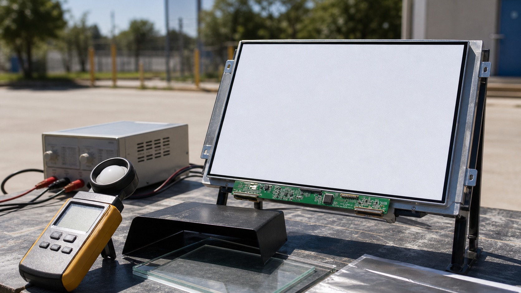
Mistake 2: testing a bare panel instead of the final stack
Many display samples are tested as bare modules. That is useful for first inspection, but it does not represent the final product. Once you add cover glass, touch sensor, adhesive, bezel, gasket, and enclosure geometry, the optical behavior changes.
Cover glass can add reflection. Touch sensors can reduce transmission. Air gaps can create extra reflective boundaries. Bezel lips can cast shadows. A glossy black front design can look premium indoors and become a mirror outdoors.
Before making a production decision, build at least one representative front stack. It does not need to be a perfect production assembly, but it should include the main optical layers and approximate spacing. Then test it with the actual UI.
Mistake 3: ignoring heat from the backlight
High-brightness TFT displays need stronger LED backlights. More backlight power means more heat, and heat affects more than comfort. It can reduce LED lifetime, shift LCD behavior, stress adhesives, increase enclosure temperature, and affect touch controller stability.
Outdoor equipment often has two heat sources at once: internal electronics and solar load. If the sun hits the front of the product, the display stack can become much hotter than ambient air. A sealed enclosure makes the problem harder.
The right question is not only whether the display can reach 1000 or 1500 nits. The question is whether the product can run at the required brightness for the required duty cycle at the expected temperature. Check backlight current, driver efficiency, thermal path, and derating. Automatic dimming can help, but it must be implemented carefully so the screen remains readable when needed.
Mistake 4: choosing the wrong surface treatment
Anti-glare and anti-reflective treatments are often discussed as if they are interchangeable. They are not. Anti-glare treatment diffuses reflections, making harsh glare less sharp. Anti-reflective coating reduces surface reflection more directly. Both can help, but each has trade-offs.
Strong anti-glare haze can make fine text look softer. Anti-reflective coatings can be excellent optically, but they need durability review, especially for public terminals, industrial panels, or displays cleaned frequently. Some surfaces show fingerprints more clearly than others. Some coatings may not tolerate aggressive cleaning agents.
The best choice depends on the product. A marine display, an EV charger, a vending machine, and a handheld industrial device do not see the same use pattern. Surface treatment should be chosen with cleaning, abrasion, touch frequency, and replacement cost in mind.
Mistake 5: forgetting polarized sunglasses
Outdoor displays may be viewed by users wearing polarized sunglasses. This can create visibility problems depending on LCD polarization and screen orientation. A display that is readable in landscape orientation may become dark or uneven in portrait orientation through polarized lenses.
This test is simple and should not be skipped. View the display through common polarized sunglasses in the intended orientation. Rotate the sample if the product may be mounted in multiple ways. If readability changes too much, discuss polarizer options or orientation constraints with the supplier.
Mistake 6: using a low-contrast UI
Display hardware cannot rescue every UI decision. Thin gray text, small icons, low-contrast buttons, and dark glossy themes may look refined on a desktop monitor but fail outdoors. Outdoor UI should be designed for glance readability.
Use strong contrast for critical information. Make important numbers and alarm states larger. Avoid relying only on subtle color differences. Test the real UI on the real display. If the product is used by operators under time pressure, readability matters more than visual delicacy.
Mistake 7: assuming all outdoor use is the same
“Outdoor” is not one condition. A shaded kiosk, a vehicle dashboard, a construction machine, a boat deck, and a wall-mounted EV charger all have different light angles, operating temperatures, vibration, cleaning routines, and user behavior.
The display specification should reflect the application. A product used under a roof may not need the same brightness as a panel facing direct afternoon sun. A battery-powered device may need a more careful dimming strategy than a mains-powered kiosk. A public device may need tougher cover glass and surface durability than a protected industrial terminal.
A better selection process
A practical selection process starts with the environment, not the datasheet. Define the lighting condition, viewing distance, mounting angle, operating temperature, touch requirement, cover glass, UI style, and expected service life. Then select brightness, bonding, coating, and thermal design together.
If possible, compare two or three display stacks under the same outdoor condition. Take photos only as notes, not as final proof, because cameras can misrepresent perceived contrast. The final decision should come from direct inspection, measured temperature, power data, and a review of supplier documentation.
Sunlight readability is a system property. The display module is important, but the complete product decides whether the user can actually read the screen.
Related Engineering Context
For the engineering side of backlight power, heat, and dimming, see the high-brightness TFT display selection guide. If the product needs better contrast behind cover glass, compare stack options in optical bonding vs air bonding.