Color Consistency in IPS Displays: What Product Teams Should Verify
An engineering-focused guide to IPS display color consistency, covering grayscale, gamma, viewing angle, backlight variation, UI impact, and production approval checks.
IPS displays are often selected because they provide stable color and wide viewing angles compared with older TN panels. That advantage is real, but it does not remove the need for color review. In a product, color consistency is affected by the LCD cell, backlight spectrum, polarizer, cover glass, touch sensor, optical bonding, viewing angle, firmware settings, and UI design.
The most useful question is not whether a sample looks good in isolation. The better question is whether multiple production units look consistent enough for the user, the brand, and the application. A small color shift may be acceptable in a basic control panel. It may be unacceptable in a medical device, inspection tool, or premium indoor interface.
Start with grayscale
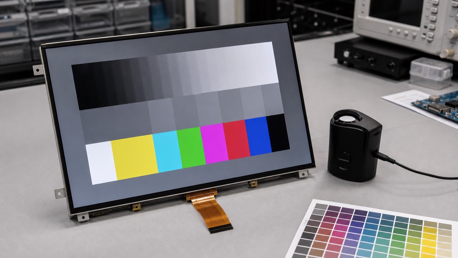
Many teams focus on saturated colors first, but grayscale usually reveals practical problems faster. Check white, light gray, mid gray, dark gray, and black screens. Look for tint differences from center to edge, color shift between samples, uneven gamma, and visible banding. If the UI uses many neutral backgrounds, this test matters more than a bright color demo.
Use the same backlight setting, warm-up time, and viewing angle for every sample. If the product uses a cover lens or bonded touch stack, test that stack because glass and adhesive can slightly change color appearance.
Compare samples, not only specifications
Datasheets may provide color coordinates, contrast, and viewing angle, but they do not fully describe production appearance. Request multiple samples from the intended production path. Compare them side by side using the same UI. If the supplier has alternate backlight bins or panel sources, ask how those variations are controlled.
| Check | What to look for |
|---|---|
| White screen | Warm/cool tint, edge variation |
| Gray ramp | Banding, gamma inconsistency |
| Brand colors | Visible shift from approved design |
| Viewing angle | Color change from typical user positions |
| Low brightness | PWM artifacts, gray crush, uneven dimming |
| Multiple samples | Unit-to-unit variation |
Firmware and UI settings matter
Color consistency is not only a panel issue. Display timing, pixel format, color depth, gamma tables, operating system settings, and UI assets can affect the result. A panel can look wrong because the RGB/BGR order is incorrect, the color range is mismatched, or the gamma is different from the design assumption.
For embedded Linux or Android products, keep display configuration under version control. For MCU systems, document initialization commands, color mode, and any gamma settings. If the product may later change panel revisions, this documentation becomes important.
Do not over-specify without reason
Strict color requirements increase cost and supplier burden. For most industrial HMIs, the target is stable readability and acceptable appearance, not monitor-grade calibration. Define which colors matter. Alarm colors, status indicators, medical measurement backgrounds, and brand-critical screens deserve more attention than decorative elements.
If the application has a real color judgment task, involve a measurement tool and define acceptance limits. If the display is mainly for controls and status, a practical visual standard with sample comparison may be enough.
Approval notes
Keep a golden sample, test the real UI, and include both normal and low-brightness modes. Review color together with the technology choice in the IPS vs TN vs VA display guide. If the product is comparing IPS against OLED, the IPS vs OLED guide explains why static UI, aging, and lifetime can matter more than first impression contrast.
Color consistency is a product-level quality signal. It should be reviewed early enough that firmware, supplier control, and UI design can still be adjusted.